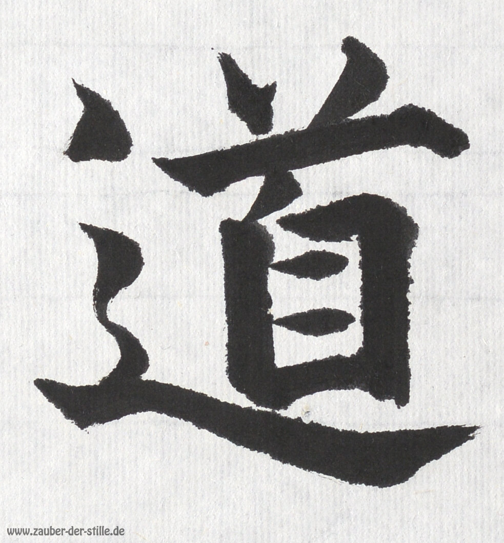
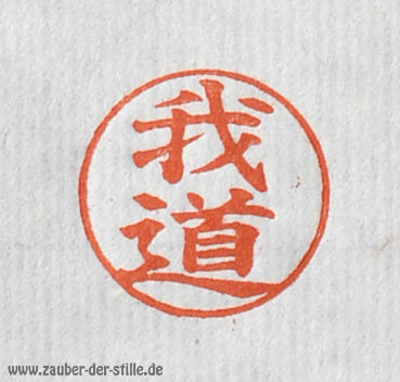
Miru-Dô - the path of seeing

Miru - to see

Dô - the path


The path of seeing -
as long as we keep our eyes open walking the path of life,
we will see beauty and joy wherever we are.


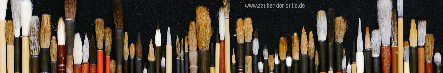
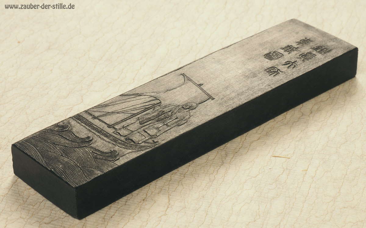
This calligraphy I painted using the following techniques and material:


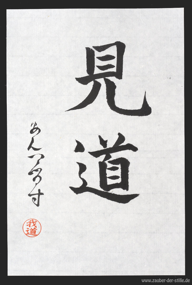
The writing style is Kaisho, classic block letter writing.

The two kanji letters are written in a straight compact and somehow bold way. This style should be well suited to the beginner and a bit advanced to exercise and manage how to hold the brush in constant angle and position during his writing.


As the paper I have chosen the XuanCheng "the sun calligraphy". This is not a machine made but a hand made Chinese artisanal paper sporting double thickness and a beautiful translucent structure of the linen fabric of the wire cloth. It is a high grade museum quality paper.

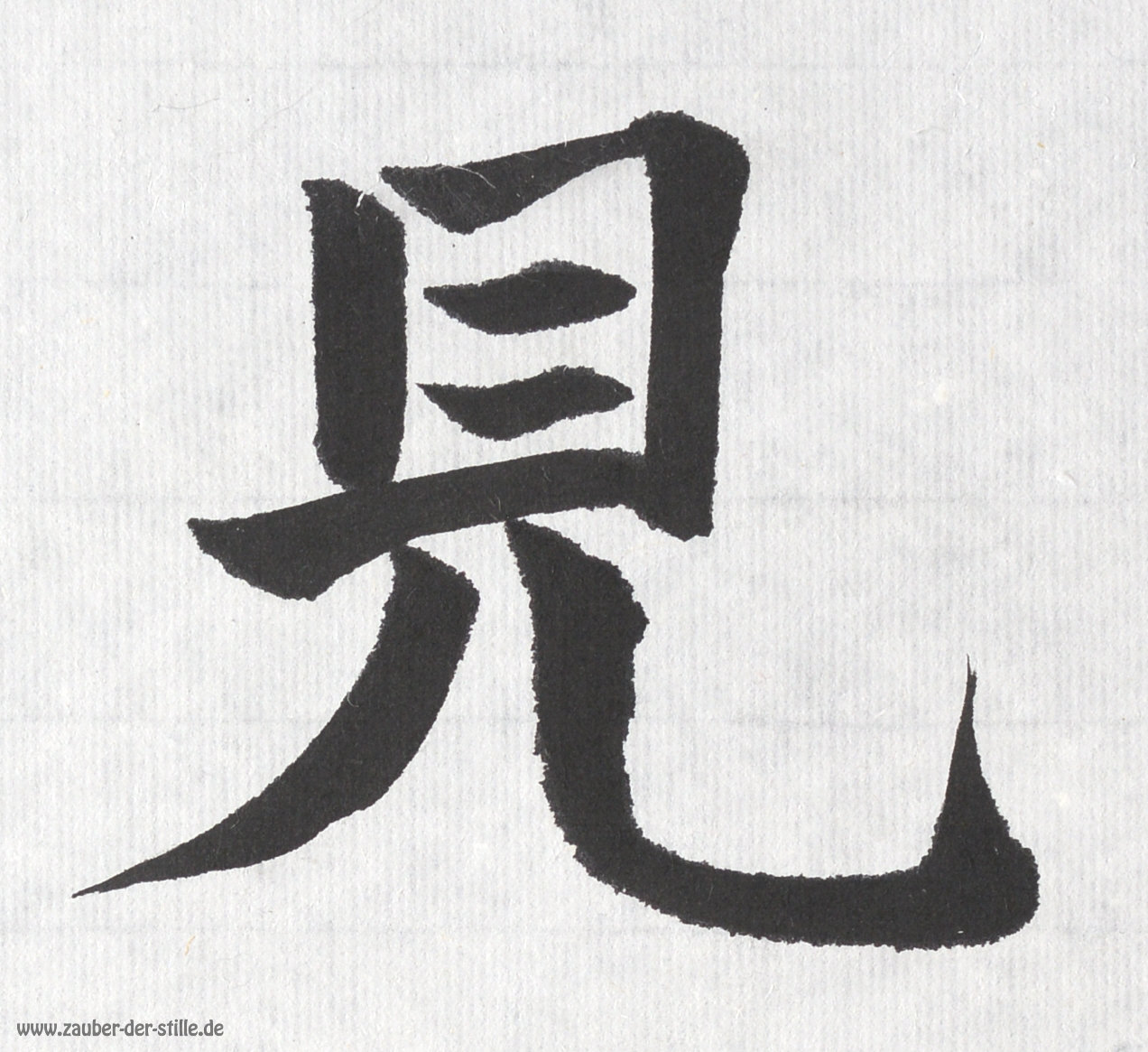
The surface structure can be enhanced by lateral illumination or being mount on a dark background fabric.


The paper absorbs ink quickly. This is most obvious looking at start and end positions of single brush strokes or at turning points whithin the more complex strokes. That means kind of a challenge to the painter as he can't afford to move the brush too slow over the paper or rest too long at a turning point nor must he press the brush too strong. Doing so, excessive ink absorbtion would lead to specks and loss of accurate contours.


This ink is a deep black sesame oil ink from Anhui province in China. The manufacturer is Hu Kai Wen, the official ink supplier of the Chinese emperor's palace. It is a hand made artisan level 101 ink ranking quite high in this class with very good tonal variety. As the stick material is more on the soft side, you can grind it faster than diamond hard ink sticks and get a good amount of strong ink within reasonable time.


The signature is written in an intermediate evolution form between 8th century Manyokana and 11th century Hiragana.

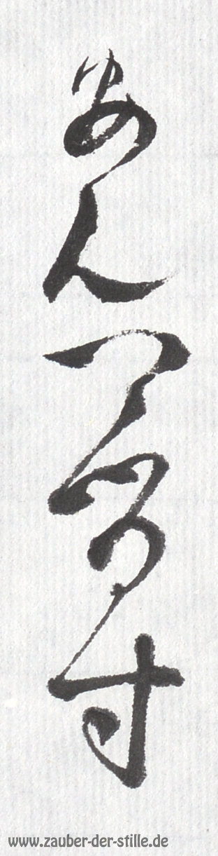
These letters are a bit unusual for a gai-koku-jin. Non-Japanese writers usually use Katakana for their signature. It took me many years before I asked my sensei for a Japanese signature proposal. She advised me to use these old syllables, which filled me with pride and happiness.

The translations for those of you, who are a bit unfamiliar with ancient Kana: A - N - Te - Ru - Su, which resembles my first name Anders.


This kind of stamp is pretty unusual for calligraphy artists. As I do regard myself not as an artist but more as an artisan, it was essential to me to express my personal understanding of my approach to Shodo. Thus from the choice between an artistic and cryptic individual stamp in stone letters and the more formal but somehow trivial "office version" of Kaisho letters, I prefered the simple one. It is more important to me, that people can read my understanding of Sho-Do - the path of writing I am walking on.


All my final works get stamped using genuine red cinnabar paste. The two Kanji are "Aru(ku)-Dô, walking the path". This resembles my above explained understanding, that I am but a wanderer on his journey.

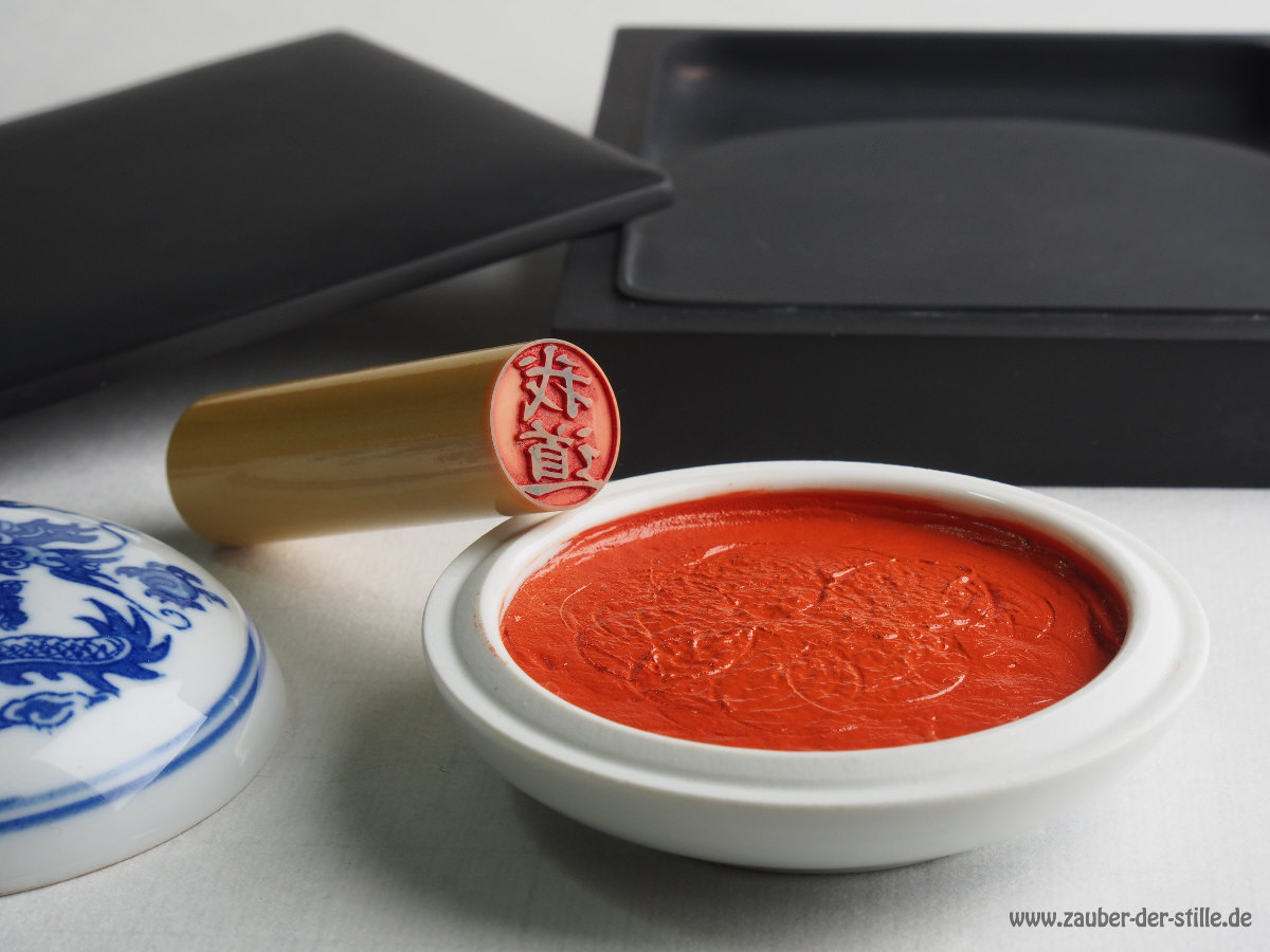
Cinnabar ink is the genuine pigment used for red stamps from the beginning of ink and paper in Asia. Its intensity and lustre colour are regarded to be unrivaled amongst modern substitute pigments.
A word about cinnabar stamp paste:

According to the US hazardous material catalogue, cinnabar paste should not be available on the US market any more and, following this classification, on the Japanese market too. To the contrary the European catalogue clearly classifies cinnabar be non toxic and non hazardous at all. Thus in Europe and in China, genuine cinnabar stamp paste is available and permitted without restrictions.